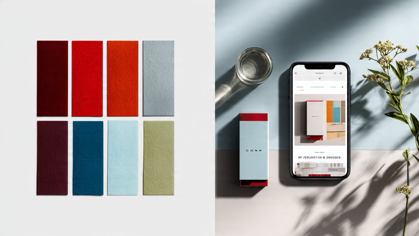
In the hyper-competitive world of Direct-to-Consumer (D2C) commerce, you have milliseconds to make a first impression. Before a customer reads your value proposition, before they see your product's price, they see your brand's colors.
And they judge.
Research has found that up to 90% of snap judgments made about products can be based on color alone. Color is not a "soft" design choice; it's a hard-hitting, C-suite-level strategic asset that directly impacts perception, trust, and conversion.
But for an Indian D2C brand, there's a critical flaw in most online guides. Relying on generic, Western-centric color psychology is like navigating Mumbai with a map of Manhattan. It's not just ineffective—it can be costly.
A color that means "creativity" in a US study might mean "renunciation" to your target customer in India. A shade that signifies "simplicity" in the West could be associated with "mourning" in some traditional Indian contexts.
In India, color isn't just psychology; it's a deeply embedded cultural language.
Choosing your brand's palette requires a dual-lens framework: one that understands the universal psychological triggers of color and one that respects the deep cultural nuances of the Indian market.
This guide is that framework.
Why Your Brand's Color Is a Business, Not a Design, Decision
Your brand identity is the entire experience you create for your customer. It's the promise you make, and your color palette is the most instant, powerful, and memorable expression of that promise. A strong, consistent brand identity is proven to build trust, create recognition, and drive profit. Studies show that consistent brand presentation can increase revenue by over 30%. When customers trust your brand—a feeling built through consistent messaging and visuals—they are more likely to buy from you, even at a higher price point. Your palette is the foundation of this consistency. It's the visual thread that ties together your logo, your website's "Buy Now" button, your performance ads, and your unboxing experience. Get it right, and you create instant recognition. Get it wrong, and you create a jarring cognitive dissonance that leaks trust and revenue.The Indian D2C Color Guide: Psychology vs. Culture
1. Red: The Color of Passion and Purity
Universal Psychology: Energy, passion, excitement, urgency. Red is known to increase heart rate. It’s the color of "Order Now" and "Limited-Time Sale" for a reason. The Indian Cultural Lens: Red is arguably the most powerful and auspicious color in the Indian psyche. It is the color of:- Auspiciousness & Celebration — marriage, fertility, prosperity.
- Power & Divinity — associated with Shakti and Goddess Durga.
- Purity — symbol of devotion and rituals.
2. Blue: The Color of Trust and Divinity
Universal Psychology: Trust, dependability, calm — perfect for finance, tech, and healthcare. Indian Lens: Divine color of Krishna and Shiva, representing infinity and protection. Also associated with status and integrity. Strategic D2C Application: Ideal for fin-tech, health-tech, electronics, skincare. (Example: Lenskart’s blue = dependable innovation.) Balance darker blues with warmer tones for approachability.3. Yellow & Saffron: The Colors of Happiness and Spirituality
Yellow (Universal): Happiness, optimism, and warmth. Yellow (India): Auspicious haldi, purity, knowledge, peace. Saffron (India): Sacred spirituality and renunciation — but politically sensitive. Strategic D2C Application: Yellow fits food, wellness, or kids’ brands. Saffron suits authentic Ayurvedic or spiritual brands only.4. Green: The Color of Nature and Prosperity
Universal Psychology: Nature, health, calm, growth. Indian Lens: Fertility, prosperity, abundance; tied to heart chakra; paradise symbolism in Islam. Strategic D2C Application: Perfect for eco-conscious or wellness brands (e.g., Mamaearth). Even finance brands use green to convey growth.5. White & Black: The Colors of Purity and Luxury
White (Universal): Purity and minimalism. Indian Lens: Purity, peace, but also mourning in tradition. Black (Universal): Elegance, authority, luxury. Indian Lens: Now widely seen as sophistication and premium. Strategic D2C Application: White brings clarity and honesty. Black signals exclusivity—ideal for premium or tech brands like boAt.Beyond the Logo: Applying Your Palette Across the D2C Ecosystem
On Your Website
Your palette guides the eye. High-contrast colors for CTAs make them stand out. Keep readable contrast for text to avoid lost conversions.In Product Photography
A white background = clarity. Lifestyle imagery uses your colors in environment storytelling, showing your product in real life.In the Unboxing Experience
The first physical touchpoint matters. Use colors on boxes, tissue, and thank-you cards for memorable, shareable experiences—part of your overall brand strategy.Conclusion: Your Color Is Your Strategy
In the Indian D2C market, color is not decoration—it’s communication. Red ribbons, blue apps, green labels—they speak emotion and trust instantly. Ask yourself:- What does my brand stand for?
- What emotion do I want my customer to feel?
- What does this color mean to my specific Indian audience?
Feeling ready to elevate your palette? Contact us or explore Brand & Web Services.
Frequently Asked Questions (FAQs)
Q1: What is the most "trustworthy" color for an Indian D2C brand?
Blue. Universally associated with trust and competence; equally valid in India. Perfect for fin-tech, health-tech, electronics, or skincare brands.
Q2: What’s the biggest color mistake Indian D2C brands make?
Ignoring cultural context. Using saffron or yellow in the wrong category can damage credibility.
Q3: How many colors should my brand's palette have?
1–2 primaries, 1–2 accents, and neutral tones (white, gray, black) for flexibility.
Q4: Can I use only black and white?
Yes. Monochrome = luxury, minimalism, precision. Great for high-end beauty, fashion, or tech brands.
Q5: My competitor uses my desired color—what now?
Either choose a new hue to differentiate, or own a unique shade/voice combo. Deep brand analysis helps clarify direction.

